Menu

FuseBeads Hub © 2026

Advanced Fuse Bead Techniques: Master Shading & Gradients

Take your fuse bead art to the next level with advanced techniques for dithering, color gradients, and realistic shading. Perfect for experienced crafters.

Débutant5 min read de lecture

Beyond Flat Colors: Why Shading Matters in Fuse Bead Art

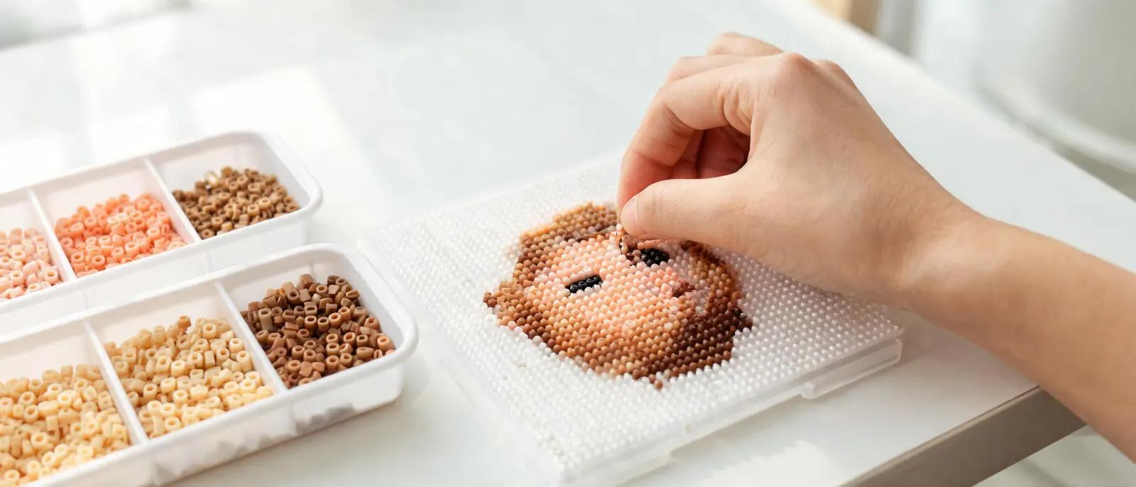
If you've been making fuse bead projects for a while, you've probably mastered the basics: following a pattern, ironing evenly, and maybe even creating 3D builds. But there's a moment when every bead artist looks at their work and thinks, "This looks flat." That's where advanced fuse bead techniques come in. Shading and gradients transform a simple pixel image into something that feels alive, with depth, volume, and realism. Whether you're creating a portrait, a landscape, or a detailed animal, understanding how light interacts with your subject is the key to making your bead art pop. The good news is that fuse beads are essentially physical pixels, and pixel artists have been solving the shading problem for decades. By borrowing techniques like dithering, color banding, and selective outlining, you can achieve stunning results without needing hundreds of colors. In this guide, we'll walk through the core methods, from simple two-tone shading to complex multi-color gradients, and show you how to apply them to your next project. If you're new to color theory, our fuse bead color guide is a great place to start before diving into these advanced methods. Before we begin, gather your materials. You'll need a pegboard (large square or multiple boards for bigger pieces), your bead stash sorted by color and shade, tweezers for precise placement, an iron and parchment paper, and a reference image. A printed photo or a digital image on a tablet works well. For complex shading, having a few extra shades of each color family—light, medium, dark—is essential. If you're just building your collection, check out our recommended fuse bead tools to make sure you have the right setup.

The Power of Dithering: Creating Illusions with Limited Colors

Dithering is the secret weapon of pixel artists, and it's just as powerful with fuse beads. The concept is simple: instead of using a solid block of one color, you alternate two or more colors in a pattern to trick the eye into seeing a blended shade. From a distance, a checkerboard of light blue and white reads as pale blue; up close, you see the individual beads. This technique is perfect for skies, water, skin tones, and any area where you want a smooth transition without having every intermediate color. There are several dithering patterns you can use. The most common is the checkerboard (alternating beads in a 1:1 ratio), which creates a 50% blend. For lighter blends, use a 1:2 or 1:3 ratio—one dark bead for every two or three light beads. You can also use a diagonal or "bayer" pattern for a more organized look. The key is consistency: once you choose a pattern, stick with it across the shaded area so the texture looks intentional. For beginners to dithering, start with a simple two-color gradient on a small project like a coaster or a magnet. When ironing dithered sections, be gentle. Over-ironing can cause the beads to melt into a muddy blend, destroying the careful pattern you created. Use a lower heat setting and iron in small circles, checking frequently. If you're unsure about ironing temperatures, our how to iron fuse beads guide covers the details. With practice, dithering becomes second nature, and you'll start seeing every image as a potential bead pattern.
The Power of Dithering: Creating Illusions with Limited Colors

Building Smooth Gradients: From Two Tones to Full Spectrum

Gradients are the next step up from dithering. Instead of blending two colors, you transition through a sequence of shades to create a smooth, continuous change. The key to a successful gradient is choosing the right colors. You don't need every shade in the rainbow—just a logical progression. For example, to shade a red apple, you might use dark red, medium red, light red, and a touch of orange for the highlight. The number of steps depends on the size of your project; larger pieces can accommodate more subtle transitions. Start by mapping out your light source. Decide where the light is coming from (top-left is a common choice) and mark the highlight, mid-tone, and shadow areas on your pattern. Then, assign a bead color to each zone. To make the transition seamless, use dithering at the boundaries between zones. This is where the two techniques combine: a hard line between medium and light red becomes a soft blend when you alternate the two colors along the edge. For a comprehensive look at color selection, refer to our fuse bead color guide. Practice gradients on a simple shape like a sphere or a cylinder. These forms have predictable shading patterns and are great for building muscle memory. Once you're comfortable, apply the same principles to more complex subjects like animals or portraits. If you're looking for inspiration, our animal ideas section has plenty of projects that benefit from gradient shading. Remember, the goal is not perfection but the illusion of depth. Even a simple three-color gradient can dramatically improve the realism of your bead art.

Advanced Shading Techniques: Selective Outlining and Highlighting

Once you've mastered dithering and gradients, you can add professional touches with selective outlining and highlighting. Selective outlining means using dark lines only where two shapes of similar color meet, or where a shadow is needed, rather than outlining every element in black. This prevents your art from looking like a cartoon and allows shapes to blend naturally. For example, in a portrait, you might outline the jawline but not the cheek, letting the skin tones merge. Highlighting is the opposite: adding a few bright beads to suggest a strong light source. A single white or pale yellow bead on the tip of a nose or the edge of a leaf can make the whole piece pop. Use highlights sparingly—too many and the image looks shiny and artificial. The best highlights are placed at the point closest to the light source and on curved surfaces. If you're making a wall art piece, consider how the final display will be lit; a wall art piece hung near a window will have natural highlights, so you might tone down your bead highlights. Another advanced technique is "color banding," where you use distinct bands of color instead of smooth blending. This is common in retro pixel art and can look very stylish with fuse beads. It's also easier to execute than fine dithering, making it a good stepping stone. Experiment with different band widths to see what works for your subject. For more inspiration on complex projects, browse our cool ideas gallery.
Advanced Shading Techniques: Selective Outlining and Highlighting

Putting It All Together: A Step-by-Step Shaded Project

Let's walk through a complete project that uses all the techniques we've covered: a shaded rose. You'll need a 29x29 pegboard, beads in red, dark red, pink, light pink, green, dark green, and white, plus tweezers and an iron. Start by finding a reference image of a rose with a clear light source. Simplify it into 3-4 shades of red and 2-3 shades of green. Sketch a rough pattern on graph paper or use a pixel art program. Begin with the darkest red for the deepest shadows at the center of the rose. Then add medium red around it, using dithering at the boundary. Next, place light red and pink for the petals that catch the light, again dithering the transitions. Add white highlights on the top edges of the petals. For the leaves, use dark green for shadows and light green for the lit areas. Finally, iron the piece gently, using the techniques from our ironing guide. Once you're comfortable with this project, try applying the same approach to other subjects. A photo frame with a shaded border, a set of Christmas ornaments with gradient baubles, or even a 3D build with realistic shading. The more you practice, the more intuitive it becomes. Don't be afraid to experiment and make mistakes—every project teaches you something new about color and light.

Troubleshooting Common Shading Problems

Even experienced crafters run into issues when shading. One common problem is "muddy" transitions, where colors blend into a dull mess. This usually happens when you use too many mid-tones or when the colors you're blending aren't closely related. To fix it, simplify your palette and use dithering instead of solid intermediate colors. Another issue is "banding," where the gradient shows obvious stripes. This can be solved by using a finer dither pattern or adding an extra shade between the bands. If your project looks flat despite shading, check your light source consistency. All shadows should fall in the same direction. Also, make sure you have enough contrast between your lightest and darkest shades. A common mistake is to use shades that are too similar. Don't be afraid to go darker in the shadows and lighter in the highlights. For more tips on color selection, see our color guide. Finally, remember that fuse beads have a slight gloss when ironed, which can affect how colors appear. If you want a matte finish, iron on a lower temperature or use a matte sealing spray. Experiment with different ironing times to see how the finish changes. With practice, you'll develop an eye for these details and be able to troubleshoot on the fly.

Questions fréquentes

How many shades do I need for realistic shading?

For most projects, 3-5 shades per color family (e.g., light, medium, dark, and maybe two intermediates) are enough. The key is contrast, not quantity. Start with three and add more only if the transition looks too harsh. Dithering can help you create the illusion of more shades without owning them.

Can I use dithering with any bead brand?

Yes, dithering works with any brand, but the bead size and shape can affect the final look. Perler, Hama, and Artkal beads are all compatible with dithering. Just make sure your beads are the same size (midi or mini) for consistent results. For a brand comparison, see our Perler vs Hama vs Artkal guide.

How do I prevent over-ironing dithered sections?

Use a lower iron temperature (around 300°F/150°C) and iron in small circles for short intervals, checking frequently. Place parchment paper over the beads and avoid pressing too hard. If you see the beads starting to flatten and lose their individual shape, stop immediately. Over-ironing is the quickest way to ruin a dithered pattern.

What's the best way to practice shading techniques?

Start with simple geometric shapes like spheres and cubes, which have predictable shading. Then move on to simple objects like fruit or leaves. Once you're comfortable, try more complex subjects like animals or portraits. Small projects like coasters or magnets are perfect for practice because they're quick to complete and don't require a huge bead investment.

Prêt à créer vos propres modèles ?

Ouvrir le créateur gratuit
Partager :